Before and After Slider: How to Use Comparison Sliders on Your Detailing Website
Where to put a before and after slider on a detailing website, how to prep matched image pairs, and the labels, phone and speed details that make it work.


A before and after slider puts two photos of the same car in one frame, with a handle the visitor drags to reveal the change. On a detailing website it works best on service pages and in a gallery, using one well-matched image pair per job, short labels, a caption that says what was done, and files small enough that the page stays fast on a phone. Get the pair right and the slider does the selling. Get it wrong and it looks like a trick.
This guide covers the website side only: where to place a comparison slider, which jobs make good pairs, how to prepare the two images so they line up, what the labels and caption should say, how the slider should behave on phones and keyboards, and when a plain side-by-side image is the better choice. If you still need to take the photos, start with our guide to before and after detailing photos. This post picks up once you have the files.
Why A Before And After Slider Suits Detailing Work
Detailing results are usually about a difference, not a single image. A clean interior looks like any other clean interior, so the proof lives in the gap between the two photos. A slider turns that gap into something the visitor controls, which makes it one of the most natural ways to show your work on a detailing website without piling on extra sales copy.
Showing The Change, Not Just The Result
A clean seat on its own says very little. The same seat shown next to its dog hair covered version tells a visitor exactly what you do and how much changed. A before and after slider makes that comparison physical. The visitor moves the handle and watches the dirt, haze or oxidation disappear on the same panel, in the same light, from the same angle. No paragraph about your attention to detail can match that.
Inviting A Closer Look
A comparison slider also asks the visitor to do something. Dragging a handle means studying your work instead of scrolling past one more photo. Nobody can honestly promise that it doubles bookings, and you shouldn’t expect it to. What it does is give your proof a format that invites attention. A visitor who drags the handle across a cloudy headlight is spending real time with your work.
Why Preparation Matters More Than Plugins
The catch is that a slider shows flaws just as clearly as results. If the two images are framed differently, the car jumps when the handle moves, and the visitor’s eye goes to the jump instead of the paint. This is why most of the work behind a good before and after slider happens before the slider tool is ever opened: choosing the right job, shooting it carefully, and lining up the two files so that only the dirt changes.
Done-for-you websites
Want your website built for you?
ReadySite writes the wording, builds up to 5 pages and sets up your Google Business Profile. $299 one time, and you see a free preview before you pay.
Where Should A Comparison Slider Go On Your Detailing Website?
Not every page needs a slider. A comparison slider earns its spot where a visitor is deciding whether you can fix their specific problem. That usually means service pages and a gallery, not the very top of the home page. Whether you build the site yourself or have ReadySite set it up for you, the same placement logic applies.
Below The Home Page Hero, Not In It
It’s tempting to lead with a slider at the top of the home page. In most cases, a single strong after photo with your headline and a call button makes a better hero. A slider loads two large images in the most speed-sensitive spot on the page, and a visitor on a phone may try to scroll and grab the handle by accident. Our guide to detailing website speed explains why that first image matters so much. If you want one on the home page, place it just below the hero with a short line such as “Swipe to see a real job from last month.” One is enough there.
Service Pages
This is where a before and after slider does its best work. Someone reading your paint correction page wants proof of paint correction, not a vacuumed floor mat. Pick one pair that matches the service exactly and place it after the description of what the service includes, before the price and the booking button. Each service page gets its own pair. If you’re still building those pages, our guide to detailing service pages covers the structure, and the slider slots neatly into the proof section of each one.
A Gallery Or Our Work Page
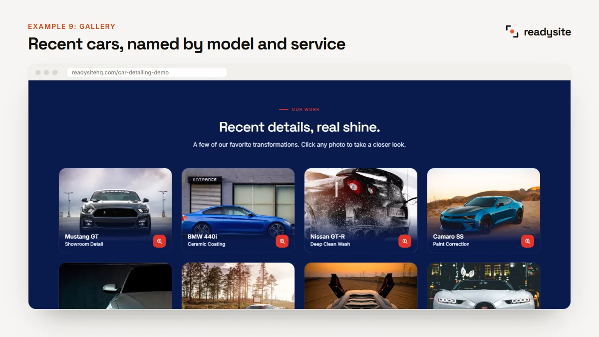
A gallery page on your detailing website can hold several sliders, grouped by service: interiors, paint correction, headlights and ceramic coatings. Put a short heading above each group so a visitor can jump to what they care about. A handful of strong pairs beats thirty average ones. If the gallery grows large, show single after thumbnails that open a full comparison when tapped.
Pages That Should Skip It
Your quote or booking page has one job: getting the form filled in. A comparison slider there pulls attention away from the form at the exact moment someone is ready to act. The same goes for your contact page. If you think visitors might want one more look before they reach out, add a simple text link to the gallery instead. That keeps proof one tap away without competing with the form.
A sensible starting point is no more than one slider below the home page hero, one per service page, and a gallery with a few pairs per service. Placing each comparison slider this way ties it to a question the visitor already has, which is what makes it useful rather than decorative.

How To Prepare A Before And After Slider Image Pair
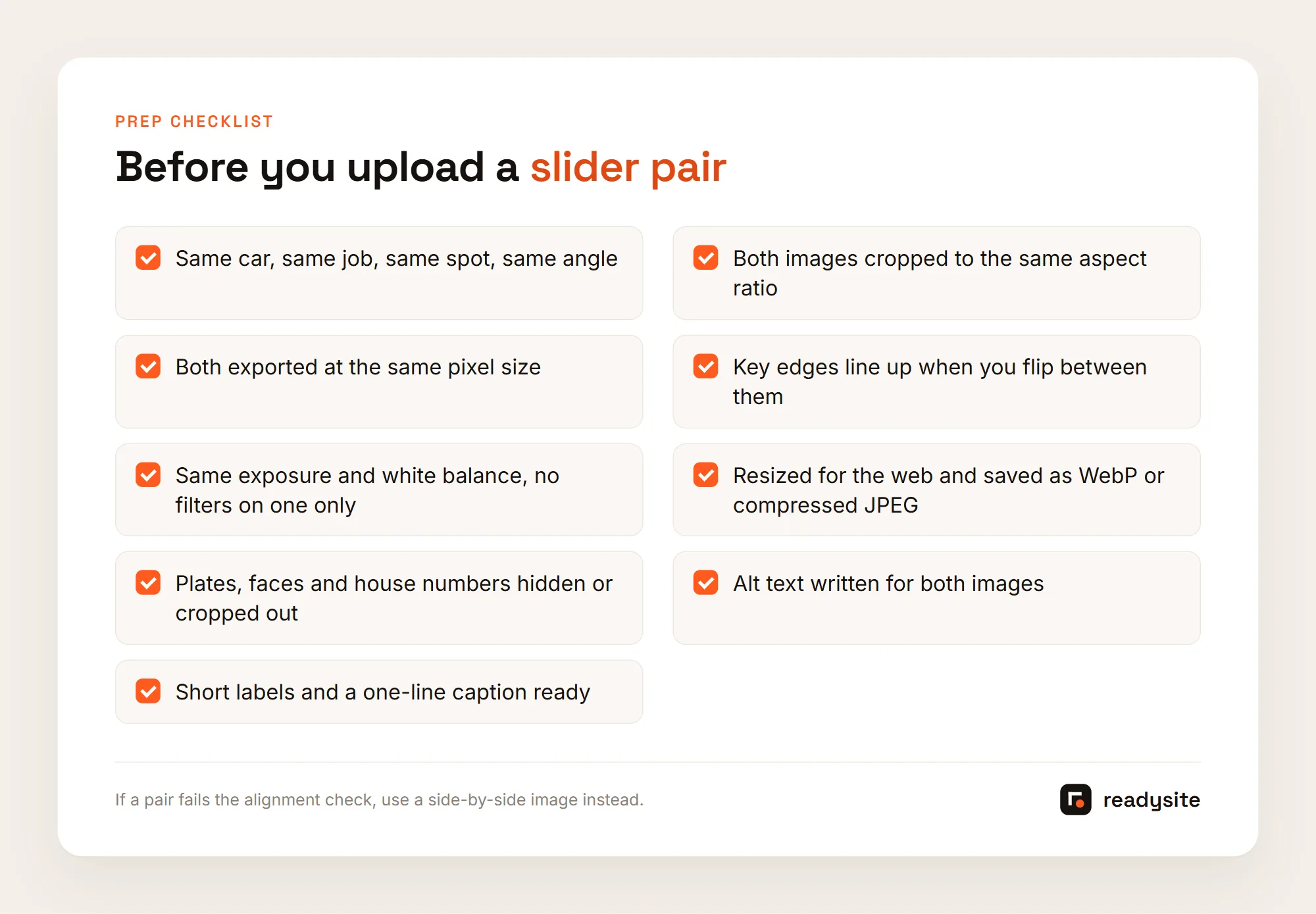
A comparison slider works by stacking one image on top of the other and revealing part of the top image as the handle moves. For that to look right, the two images must be the same shape, the same size and pointed at the same thing. Here’s the order to do it in, starting before you even pick up a brush.
Pick Jobs That Make Strong Pairs
The best pairs show a big, visible change in a small, fixed area. Headlight restoration on one lens, pet hair on one seat or cargo area, stain extraction on one cushion, paint correction on one panel under the same light, faded trim on one bumper, an engine bay from one angle, or one wheel going from brake dust to clean all work well. When you plan a job, decide in advance which area will be the slider pair, and take that before shot with extra care.
Weak candidates show a subtle change across a whole car. A full exterior wash on a lightly dusty car is real work but hard to see at phone size. Ceramic coating alone shows poorly in a still photo, because its value is mostly protection and water behavior, so a short video of water beading usually explains it better.
Match The Framing And Align The Two Images
For a clean comparison slider, start with photos taken from the same spot and angle, then crop both to the same aspect ratio. Pick one ratio for your whole site, such as 4:3 or 3:2 landscape, because mixed ratios make some sliders shorter than others. Crop the after image first, since it’s the one visitors remember, then match the before crop to it. Even with careful shooting, the second photo is often slightly rotated, shifted or zoomed, so it usually needs a little alignment work.
Open both in an editor that supports layers, which many free tools do. Place the after on top at about half opacity and nudge, rotate or scale it until panel gaps, badge edges, the headlight outline or a seat seam line up. Then crop both to the same final rectangle. For a quick test, flip back and forth between the two exported files in your phone’s photo viewer. If the car stays still and only the dirt changes, the pair is ready.
Keep Exposure And Color Honest
Make the same adjustments to both images. If you brighten the after but leave the before dark, you’re exaggerating the result, and a slider makes that easier to spot than a single photo, because visitors compare the two pixel by pixel. Our photo guide covers the editing rules in more detail, but the short version is simple: anything you do to one image, you do to the other. No filter on one side only, no extra darkening of the before, and no retouching scratches out of the after.
Export The Right Size And Reserve The Space
Each comparison slider loads two full images, so file size matters twice. Resize both to roughly the largest width they’ll display at, often around 1200 to 1600 pixels wide, rather than uploading straight from your phone. Save them as WebP if your site accepts it. Google’s web.dev guide notes that WebP files are usually 25 to 35% smaller than comparable JPEGs, though a well-compressed JPEG is fine too.
If the browser doesn’t know how tall the slider will be before the images load, the content below it jumps down when they arrive. Google’s guide to optimizing Cumulative Layout Shift recommends always giving images width and height attributes, or reserving the space with an aspect ratio. Most builders handle this when you upload images at their real size, and identical dimensions for both images make it easier.
That might sound like a lot, but it takes a few extra minutes on site and maybe fifteen at the desk once you’ve done it a few times. The result is a pair that sits still, tells the truth and loads quickly.
Key Details That Make A Before And After Slider Work
Once the pair is ready, a few small decisions decide whether the slider actually communicates. The words around it, where the handle starts, and how it behaves under a thumb or a keyboard all matter as much as the photos do. A comparison slider without words leaves the visitor guessing about what they’re looking at.
Labels And A Caption That Explains
Most before and after slider tools add “Before” and “After” labels in the corners. Keep them that short, and check they sit on the correct side, because swapped labels are a common slip when images are uploaded in the wrong order. Avoid a logo or watermark across the middle, since it covers what the visitor is trying to compare. The caption carries the meaning, so write it as plain text on the page, not baked into the image. Say what car, what job and what changed.
For example: “Front seats on a family SUV: pet hair removal and fabric shampoo, about two hours.” Or: “Hood on a black sedan after a one-step polish. Light swirls removed; deeper scratches remain.” The second example is worth copying, because it says what didn’t come out. Visitors tend to trust a detailer who admits limits.
Where The Handle Starts
The default handle position decides what the visitor sees before they touch anything. The middle is a safe default, but only if the middle of the image actually shows the change. If the stain is on the left of the seat, start the handle so the stain is split, half before and half after. A visitor who never touches the slider should still see the difference. Avoid a slider that animates on its own in a loop. Constant motion is distracting.
How It Behaves On Phones
Most visitors will see your detailing website on a phone, so test every comparison slider on one. Scrolling should still work. A slider that grabs every touch can trap people, so a good one responds to sideways drags on the handle and lets up and down swipes scroll the page. The handle should be big enough for a thumb, with a visible circle or arrows. Tight crops read better than wide shots, since fine swirl marks can vanish on a small screen.
Keyboard Access And Alt Text
Someone using a keyboard should be able to Tab to the handle and move it with the arrow keys. The W3C’s slider pattern guidance describes the expected keys: arrows to move a step, Home and End to jump to either end. You don’t need to build this yourself, but test any tool you choose. Each image also needs its own alt text describing what it shows. “Before” and “after” alone tell a screen reader user nothing, while “Driver seat covered in light dog hair” and “Same driver seat, clean, after pet hair removal” make the change clear.
The W3C’s images tutorial explains how to write alt text based on what an image is for. And because some visitors will never drag the handle, the caption should state the result in words, so the point lands even if the slider script fails to load.
These details take a few minutes per comparison slider, and once you get them right, the same approach works for every new pair on your detailing website.
Mistakes To Avoid With A Before And After Slider
Most problems with a before and after slider come from the same few habits: mismatched or edited pairs, too many sliders on one page, and using a slider where a simpler image would work better. A slider invites close inspection, so these mistakes show up faster than they would in a single photo on your detailing website.
Mismatched Or Misleading Pairs
Never pair a before from one car with an after from another, even if they look identical. Use only photos of jobs you or your team did, not stock images, manufacturer photos or another detailer’s work. Don’t retouch scratches out of the after or add a filter to one side. If the light changed a lot between shots, say so in the caption or pick a different pair. Get the owner’s permission and crop out plates, faces and house numbers. Claims on your detailing website should be as truthful as anywhere else you advertise, so keep them to what the photo actually shows.
Too Many Sliders On One Page
Every comparison slider is at least two full-size images plus the script that runs the handle. One on a service page is light. Ten stacked on a gallery page, each with two uncompressed phone photos, can make that page slow on mobile data. A practical rule of thumb is zero or one on the home page, below the hero; one on each service page; a handful per service group in the gallery; and none on quote or contact pages. Lazy loading, where images further down only load as the visitor scrolls, helps keep a gallery fast.
Using A Slider When Side By Side Is Better
A before and after slider isn’t always the right tool. If the car moved or the angle changed, a slider exaggerates the mismatch, while a side-by-side image hides small framing differences. Google Business Profile posts, social media, emails, quotes and printed flyers can’t run a slider at all. If your builder has no comparison block, a clean labeled side-by-side image beats a clunky add-on. Many detailers use both: a before and after slider on each service page for close inspection, and side-by-side images for sharing. For social stories, stack the two halves vertically.
Skipping The Plan Before The Job
The best sliders start before you pick up a brush. When a booking comes in for a job that suits one, note which page it will go on, which area you’ll shoot, what you expect to change and where the handle should start. Example (illustrative): a mobile detailer with a headlight restoration booked writes “Headlight page, passenger lens, yellowing and haze, handle starts at center of lens.” She shoots the before at headlight height, marks the spot with tape, and shoots the after from the same mark.
At home she aligns the pair, exports both at the same size as WebP, writes alt text for each, and adds the caption “Passenger headlight on a 2014 hatchback: sanding, polishing and UV coating.” The result fits the page it lives on, lines up cleanly and explains itself.

Avoiding these mistakes mostly means slowing down for a few minutes on each job. Want to see how other detailers lay out proof? Our roundup of the best detailing websites shows patterns worth borrowing, and our guide to car detailing website design covers where proof sits in an overall layout.
Conclusion
A before and after slider is one of the clearest ways to prove what your detailing work does, but only when the pair lines up, the edits are honest, the files are small and the caption explains the change. Put one on each service page, keep a focused gallery, test every slider on your phone, and fall back on a side-by-side image whenever a pair doesn’t match. Start with your three best pairs from recent jobs, one per main service, and run each through the steps above.
If you’re setting up your site now, you can build your car detailing website free with ReadySite and add your photos, services and one-tap contact options as you go. Prefer to hand the website part off? Request a free preview of a done-for-you site. ReadySite writes the wording and lays out your pages, and you only pay if you like what you see.
Done-for-you websites
Want your website built for you?
ReadySite writes the wording, builds up to 5 pages and sets up your Google Business Profile. $299 one time, and you see a free preview before you pay.